Solutions
Customer Support
Resources
LEARN: HOW TO & GUIDES ON CONTRACTS


Every major financial obligation a business holds sits inside a contract. This guide covers the main types of finance contracts, the provisions that matter most, and how to stay on top of them.


When finance and legal work from disconnected tools, contracts become a bottleneck. Here is how to align both teams with automated workflows, shared visibility, and AI-powered contract data.
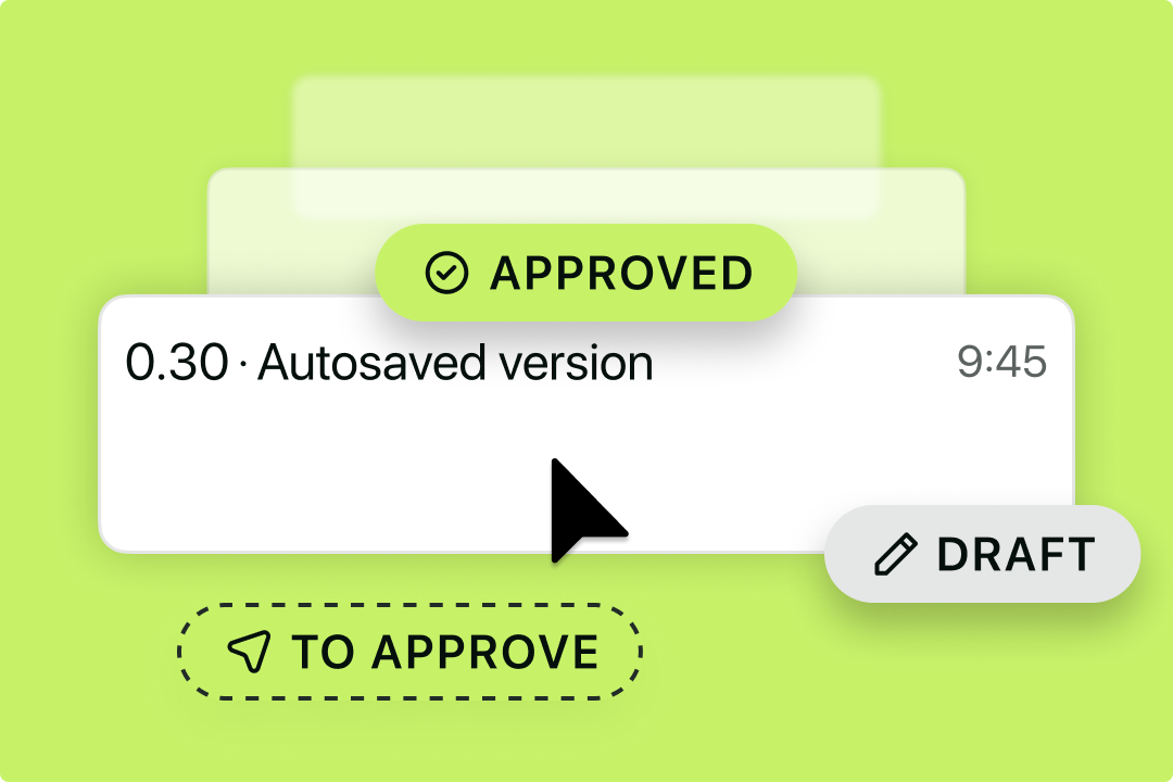

A contract audit trail records every edit, approval, and signature on an agreement. Learn what finance teams need from audit trail functionality, and how CLM makes it audit-ready by default.


This guide explains net 30, net 60, net 90, net 15, and early payment discounts — and how finance teams can audit and standardize payment terms across a contract portfolio.


Compare the best contract repository software for finance teams in 2026 — including tools that track committed spend, surface renewal risk, and integrate with your finance stack.


Comparing spreadsheets vs CLM software for contract tracking? Here's what the switch actually looks like - and why most finance teams make it sooner than they planned.


Committed spend is what you've promised to pay. Actual spend is what you've paid. Learn how contract terms create financial obligations - and how to track them before they catch you off guard.


What do investors look for in your contracts? This guide covers the key contract types, common red flags, how to run a pre-funding audit, and how to build a data room that gives investors confidence.


Discover how businesses like yours are cutting contract cycles down and enabling the business to grow faster as a result.


AI hasn’t killed the billable hour, but it has exposed its weakest assumption: that time is still a reliable measure of value.


Lean legal teams don’t need more hours — they need smarter systems, and these eight Legal Ops hacks show how to win back time fast.


From contract review and knowledge management to predictive analytics and compliance, legal AI promises faster turnaround times, reduced costs, and more strategic work for lawyers.


Icertis is a popular choice across enterprise businesses. But is it the right option for your team? Explore the best Icertis alternatives in this guide.


When sales teams evaluate contract lifecycle management (CLM) tools, one question dominates the conversation: how well does this integrate with our CRM?


Contracts are at the heart of every business deal, but reviewing them is often slow, repetitive, and resource-intensive. That’s changing - and fast. Discover the role AI contract readers are playing in this shift.


Legal workflow automation helps in-house legal teams streamline contracts, approvals, and more — boosting speed, consistency, and control at scale. Are you ready to get started?
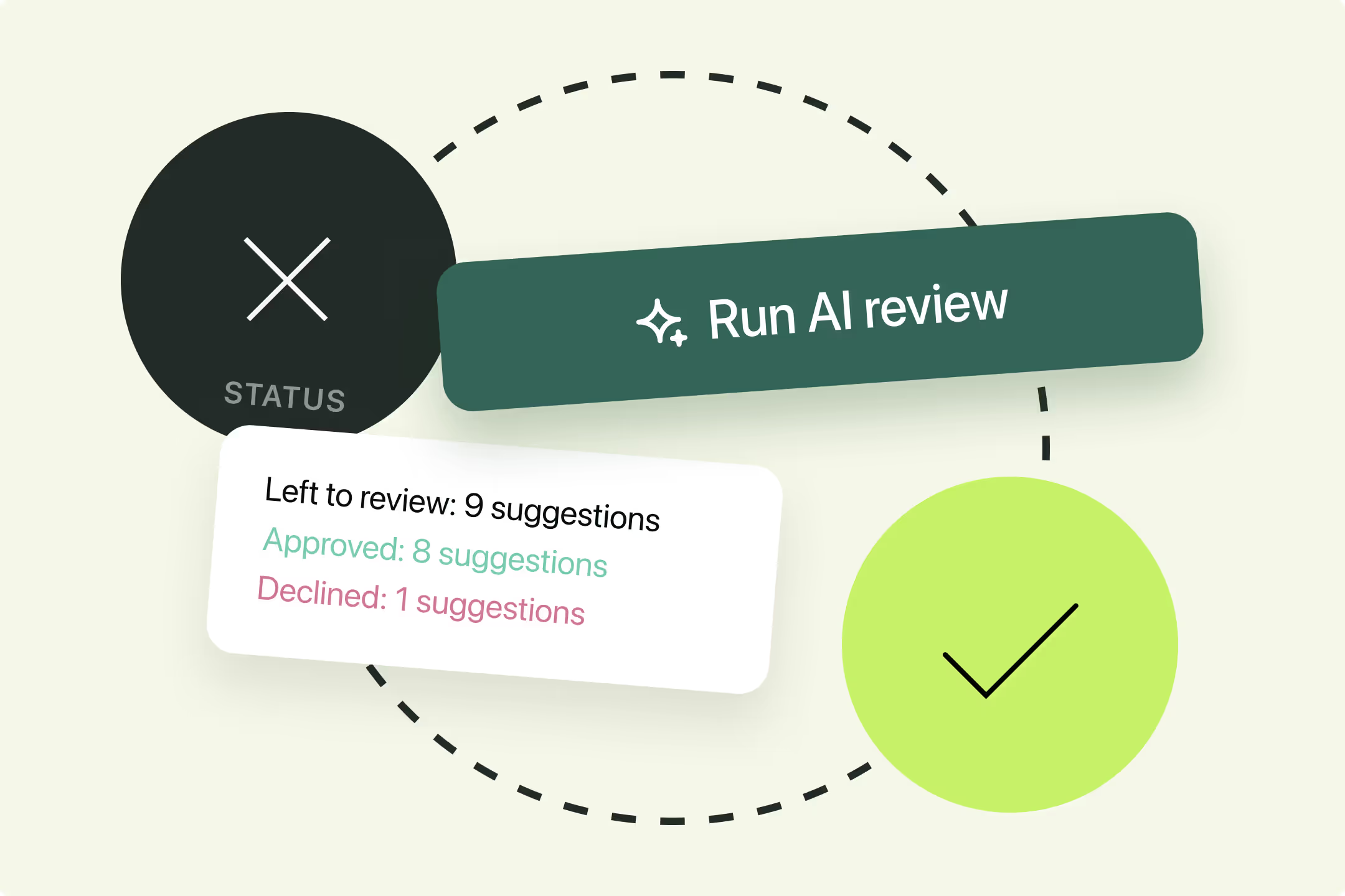

In this guide, we’ll explore how modern legal AI is reshaping contract negotiation, and how in-house teams can start building scalable redlining frameworks with technology that truly understands the deal.


The legal industry is being redefined by AI, but not in the way the headlines suggest. We look closely at the rise and reality of the automated lawyer in this guide.


Can you review contracts with ChatGPT? And more importantly, if you can, should you? This practical, detailed guide answers these questions, and more.


Contract review is one of those legal jobs that’s essential, repetitive, but also ripe for automation. That's where contract review agents come in.


In this article, we unpack the eight key trends shaping the evolution of legal operations in 2026 — and what they mean for teams ready to lead the change.


Contracts are becoming more complex, and more people are involved in managing them. So, how do you set your contract management team up for success?


Is contract management outsourcing worth it, or are there better ways to reduce time and money spent on contracts? Find out in this guide.


How do B2B contracts compare do B2C agreements, and what does this mean for how you manage them? Find out in this deep-dive guide on B2B contracting.


Sending dozens—or hundreds—of contracts for signature shouldn’t feel like a full-time job. And with bulk signatures, it doesn't have to. Learn everything you need to know about bulk signing in this guide.


Every major financial obligation a business holds sits inside a contract. This guide covers the main types of finance contracts, the provisions that matter most, and how to stay on top of them.


When finance and legal work from disconnected tools, contracts become a bottleneck. Here is how to align both teams with automated workflows, shared visibility, and AI-powered contract data.


A contract audit trail records every edit, approval, and signature on an agreement. Learn what finance teams need from audit trail functionality, and how CLM makes it audit-ready by default.


This guide explains net 30, net 60, net 90, net 15, and early payment discounts — and how finance teams can audit and standardize payment terms across a contract portfolio.


Compare the best contract repository software for finance teams in 2026 — including tools that track committed spend, surface renewal risk, and integrate with your finance stack.


Comparing spreadsheets vs CLM software for contract tracking? Here's what the switch actually looks like - and why most finance teams make it sooner than they planned.


Committed spend is what you've promised to pay. Actual spend is what you've paid. Learn how contract terms create financial obligations - and how to track them before they catch you off guard.


What do investors look for in your contracts? This guide covers the key contract types, common red flags, how to run a pre-funding audit, and how to build a data room that gives investors confidence.


Discover how businesses like yours are cutting contract cycles down and enabling the business to grow faster as a result.


AI hasn’t killed the billable hour, but it has exposed its weakest assumption: that time is still a reliable measure of value.


Lean legal teams don’t need more hours — they need smarter systems, and these eight Legal Ops hacks show how to win back time fast.


From contract review and knowledge management to predictive analytics and compliance, legal AI promises faster turnaround times, reduced costs, and more strategic work for lawyers.


Icertis is a popular choice across enterprise businesses. But is it the right option for your team? Explore the best Icertis alternatives in this guide.


When sales teams evaluate contract lifecycle management (CLM) tools, one question dominates the conversation: how well does this integrate with our CRM?


Contracts are at the heart of every business deal, but reviewing them is often slow, repetitive, and resource-intensive. That’s changing - and fast. Discover the role AI contract readers are playing in this shift.


Legal workflow automation helps in-house legal teams streamline contracts, approvals, and more — boosting speed, consistency, and control at scale. Are you ready to get started?


In this guide, we’ll explore how modern legal AI is reshaping contract negotiation, and how in-house teams can start building scalable redlining frameworks with technology that truly understands the deal.


The legal industry is being redefined by AI, but not in the way the headlines suggest. We look closely at the rise and reality of the automated lawyer in this guide.


Can you review contracts with ChatGPT? And more importantly, if you can, should you? This practical, detailed guide answers these questions, and more.


Contract review is one of those legal jobs that’s essential, repetitive, but also ripe for automation. That's where contract review agents come in.


In this article, we unpack the eight key trends shaping the evolution of legal operations in 2026 — and what they mean for teams ready to lead the change.


Contracts are becoming more complex, and more people are involved in managing them. So, how do you set your contract management team up for success?


Is contract management outsourcing worth it, or are there better ways to reduce time and money spent on contracts? Find out in this guide.


How do B2B contracts compare do B2C agreements, and what does this mean for how you manage them? Find out in this deep-dive guide on B2B contracting.


Sending dozens—or hundreds—of contracts for signature shouldn’t feel like a full-time job. And with bulk signatures, it doesn't have to. Learn everything you need to know about bulk signing in this guide.


Without effective contract management processes, procurement teams fall at the first hurdle. But what makes a robust procurement contract management strategy, and how can you achieve one?


Both Dropbox Sign and Docusign are big names in the eSignature world. But which is the right tool for you? Find out in this guide.


Seeking to standardize contract processes but not sure where to start? This guide to contract management plans has you covered.


What does a legal operations manager do in 2026, and what do you need to know if you're on the path to becoming one?


What are authorized signatories, and how can you protect their role in the contract execution process? Find out in this guide.


Discover the 5 best legal operations certifications for professionals like you in 2026, and how they compare.


Legal teams in scaling businesses are under constant pressure to do more with less. A legal front door could be the solution.


Haven’t got a signature policy in place yet? Looking to increase adoption of the one you already have? Either way, this guide can help.


Generative AI is evolving quickly, so there's a lot to learn. Discover the best generative AI courses on offer in 2025 to keep you up to speed.


Generative AI provides many benefits to sales teams, helping to drive sales and efficiency. Here are some of the top use cases for sales departments in 2025.


What is a digital sales room, and is it the right fit for your team? Explore the benefits of a digital sales room in 2025, and what other solutions are on the market.


The clauses within your contracts are make or break. Are you well-versed in the clauses you need to include and the purposes they serve?


Discover the value of effective post-award contract management processes, and how your organization can tackle contracts post-signature.


Is email admin distracting you from higher-value legal tasks? You aren't the only one. Explore email management tips for lawyers in this guide.


Complex contract terms only make it harder for an agreement to be understood and performed. Fortunately, you can find out how to resolve contract ambiguity and achieve clarity in this guide.


Contractbook is a recognized name in the CLM industry, and a decent tool for contract management. But are there better options out there?


Are large volumes of service contracts creating friction for your legal and business teams? Check out this guide to service contract management.


Want to automate contract creation and tracking for your business? Check out this guide on how to manage contracts in Smartsheet.


Typeform helps businesses get all kinds of key forms filled in while looking great on your website, but how does it fare when it comes to contract management?


Managing marketing campaigns with ActiveCampaign is a breeze, but what about those all-important contracts?


Want to automate contract creation and tracking for your business? Check out this guide on how to manage contracts in Google Sheets.


Want to automate contracts and unblock growth for your business? Check out this guide to Jotform contract management.


Managing contracts efficiently is crucial for businesses to ensure compliance, streamline operations, and enhance productivity. But can you do that from your CRM if you’re using Workbooks?


Want to use Google Forms to streamline contract requests? This guide explores how you can use Google Forms for contract management, automating contracts and saving legal's time.


Can legal and sales teams use Freshsales for contract management, and if so, how does it work? Find out in this guide.


Want to automate invoicing and contracting with Stripe? This guide tells you how to get started with Stripe contract management.


Can you use Personio for contract management, and if so, how does it work? Find out in this guide.


Discover how you can use Vitally to manage your contracts, and how an integration with Juro can eliminate repetitive contract admin for your business.


Want to streamline your contract management processes within Trello? This guide tells you everything you need to know about Trello contract management.


Can you manage contracts in Airtable and improve visibility into contracts for your business? Find out in this guide.


Looking to better manage your construction contracts? This guide to Procore contract management is here to help.


Discover how to manage contracts without leaving Shopify, and how an integration with Juro can eliminate repetitive contract admin for your e-commerce business.


Discover how Jobber contract management works, and how an integration with Juro can eliminate repetitive contract admin for your business.


Looking to improve visibility into contracts and progress contracts faster? This guide to Microsoft Teams contract management has you covered.


Discover how Sage contract management works, and how an integration with Juro can eliminate repetitive contract admin for your legal, finance and ops teams.


Confused about Docusign's support options and how to get your query resolved? Explore your options.


This guide explains Docusign pricing, including the features included in each plan, and what you should consider before committing to the platform.
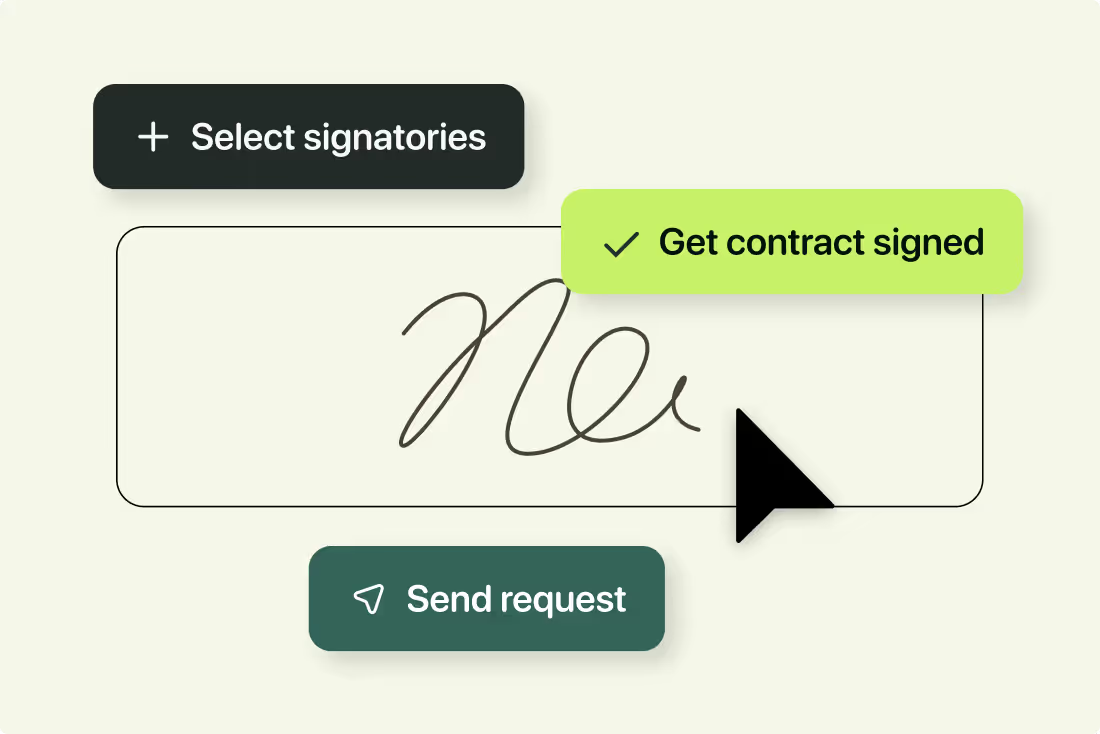

Explore Docusign's security features and discover whether it's suitable for your business in 2024.


How does Docusign's HubSpot integration work, and is it right for your team? Find out in this guide.


Explore what's possible with Docusign's Salesforce integration, and whether it'll be the right fit based on your requirements.


What are Docusign PowerForms, and when should you use them? This guide takes you through the process step-by-step


How do Docusign envelopes work, and how many are included in your plan? Get answers to all of your questions in this guide.


The ability to send documents for signing in bulk is a game-changer for businesses with large volumes of repetitive contracts. But how does Docusign’s bulk send feature work, and how does it compare to other tools on the market?


Discover how Docusign templates work and whether they're suitable for your team's needs and use cases in 2024.


Explore what Docusign is, how it works, and what you need to know before signing up, including how much it costs and whether there are better tools on the market.


Contract permissions are a great way to keep control over contract terms and protect the masses of sensitive or confidential data stored in your contracts. But what exactly are they, and what do they enable you to do?


Contract management processes and challenges are constantly evolving. These contract management statistics will bring you up to speed.


Looking for an eSignature tool but not sure where to start? We've got you covered. Discover the best electronic signature solutions for teams in 2024.
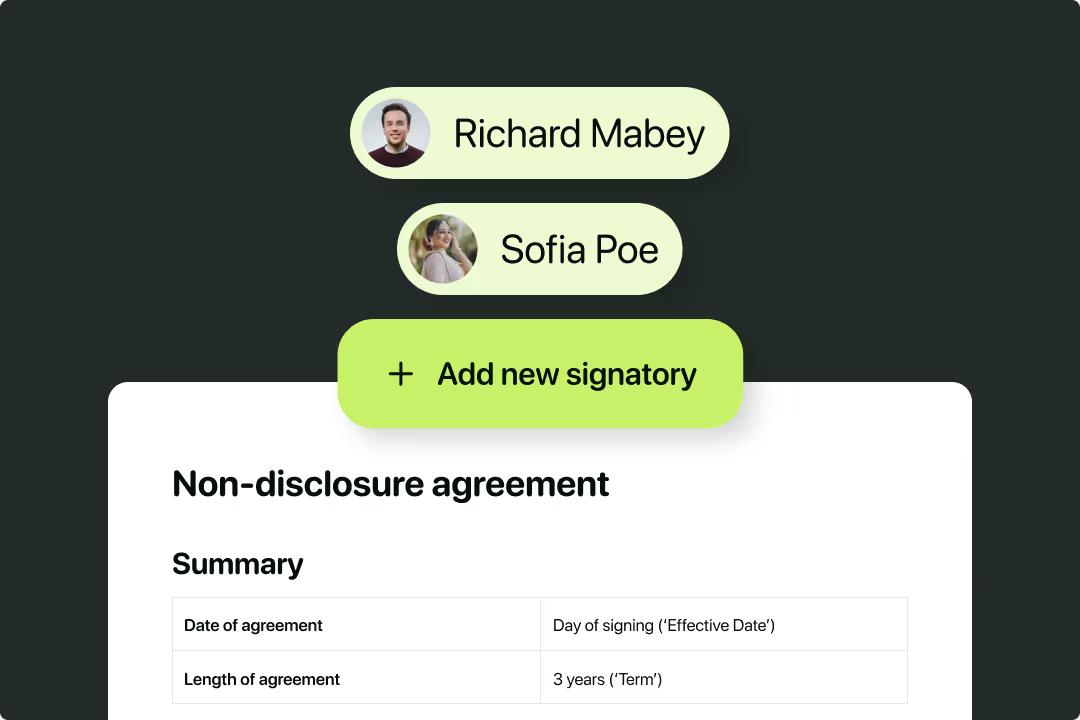

Discover how to set up a contract management policy that actually gets adopted in this guide.


Discover how to improve your contract management process and make it quicker and easier for your business to capture revenue.


The concept of digital contract management has been around for a while now. But what does it mean for legal teams in 202?


Contract risk management rolls allow you to evaluate the risk contained within a contract and take conscious steps to mitigate it.


Looking for a fast and efficient way to create contracts? Contract assembly software could be exactly what you need.
.avif)

Discover the benefits of contract management software for forward-thinking businesses in 2026.


Payer contract management is important in handling the relationship between payer organizations and healthcare providers.


Icertis is a popular CLM solution for household brands. But is it right for your business? Discover Icertis features, reviews, pricing and alternatives in this guide.


Find out how better contract management can enable insurance companies to track key risks and grow their bottom lines in this detailed guide.


Small errors can quickly amount to a costly crisis for government institutions, making contract management process with high stakes. Are you equipped?


Discover how contract management software enables schools, colleges and higher education bodies to manage contracts faster and more efficiently in 2025.


Discover how teams like yours are using ClickUp for contract management by integrating the tool with Juro.


Contract extraction software does what it says on the tin: it extracts the key data from your contracts. But how should you use this information to streamline your business operations?


Confused about the differences between CLM software and AI point solutions? You're in the right place.


Document automation software can streamline this process and enable businesses to work faster. But what is it and how should you use it?


How effectively you manage your vendor relationships determines how much value you can gain from them, as well as how much risk you take on. This begins with how you research and decide which vendors you’re going to work with.
.avif)

Discover what cost-reimbursement contracts are, some practical examples of them, and how CLM can enable you to manage every aspect of your cost-reimbursement contracts more efficiently.


Visual contracts seek to make legal agreements more accessible. But what exactly are they, and how does this modern approach to contracting align with your wider business objectives?


Are manual contract creation processes leaving your legal team buried in low-value admin work? Find out to streamline the process in this guide.


Managing contracts is no easy task, especially when those contracts contain key deadlines you can’t miss. That’s where contract milestones come into play, but what are they and how should they be managed?


Auto-renewal contracts are a staple in the subscription-based software industry, but how do you ensure you’re creating legally binding contracts auto-renew contracts that work for everyone?


Find out exactly what termination clause is, what the common grounds are for contract termination, what the different types of termination of contract clauses and finally, how to manage those in a fast-paced business.


Are delays in the contract process slowing your growth? Discover a faster and more efficient way to initiate contracts.


Procurement teams rely heavily on data when making strategic decisions. But do they have their eyes on the right metrics? Find out in this guide to procurement KPIs in 2026.


Discover what a time and materials contract is, when you should use them and how to effectively manage them using contracting software.


Discover what revenue intelligence is and how it can enable you to work smarter, not harder in 2026.


Sales metrics are complex, especially when you’re in a SaaS business. But which of these should sales teams be focussing on and how should you measure each metric?


Every major financial obligation a business holds sits inside a contract. This guide covers the main types of finance contracts, the provisions that matter most, and how to stay on top of them.


When finance and legal work from disconnected tools, contracts become a bottleneck. Here is how to align both teams with automated workflows, shared visibility, and AI-powered contract data.


A contract audit trail records every edit, approval, and signature on an agreement. Learn what finance teams need from audit trail functionality, and how CLM makes it audit-ready by default.


This guide explains net 30, net 60, net 90, net 15, and early payment discounts — and how finance teams can audit and standardize payment terms across a contract portfolio.


Compare the best contract repository software for finance teams in 2026 — including tools that track committed spend, surface renewal risk, and integrate with your finance stack.


Comparing spreadsheets vs CLM software for contract tracking? Here's what the switch actually looks like - and why most finance teams make it sooner than they planned.


Committed spend is what you've promised to pay. Actual spend is what you've paid. Learn how contract terms create financial obligations - and how to track them before they catch you off guard.


What do investors look for in your contracts? This guide covers the key contract types, common red flags, how to run a pre-funding audit, and how to build a data room that gives investors confidence.


Discover how businesses like yours are cutting contract cycles down and enabling the business to grow faster as a result.


AI hasn’t killed the billable hour, but it has exposed its weakest assumption: that time is still a reliable measure of value.


Lean legal teams don’t need more hours — they need smarter systems, and these eight Legal Ops hacks show how to win back time fast.


From contract review and knowledge management to predictive analytics and compliance, legal AI promises faster turnaround times, reduced costs, and more strategic work for lawyers.