


🇺🇸 1 Boston Place, Suite 2600, MA 02108
🇬🇧 2 Pear Tree Court, London EC1R 0DS
© 2026, Juro. All rights reserved.

🇺🇸 22 Boston Wharf Rd, Boston, MA 02210
🇬🇧 2 Pear Tree Court, London EC1R 0DS
© 2026, Juro. All rights reserved.
Law and design are two separate fields. But what if there was a way to use design principles to improve the way legal processes and documents work?
To find out what legal design is, how it works, and what it looks like in 2026, read on.
Legal design is the application of design thinking to the world of law. It involves redesigning the legal systems, documents, and services we use today to make them more human and user-centric.
Rather than looking at law through the lens of a lawyer, legal design considers how law is perceived by the layperson, and how it can be redesigned to better meet their needs.
{{quote1}}
This could mean anything from redesigning contracts to make them more digestible to making legal processes more interactive through technology. But before we explore examples of legal design in practice, let’s first look at what ‘design thinking’ means.
Lots of people assume that design thinking is simply about making things look pretty. It isn’t.
Design thinking is about taking a more creative approach to problem-solving. It’s about rethinking a problem to understand what the user’s experience is, what problems they’re encountering, and how they can be solved.

To achieve this, design thinking involves the following steps:
Legal design is important because legal documents, processes, and concepts are famously complex. But when people don’t understand law, it makes it hard for them to engage with it and protect their own interests.
Without legal design, individuals will remain stuck in processes they don’t understand, making promises they can’t comprehend, and signing contracts they haven’t even read.
Legal design can operate at various different levels within the legal industry. Let’s look at a few examples of legal design in practice now.
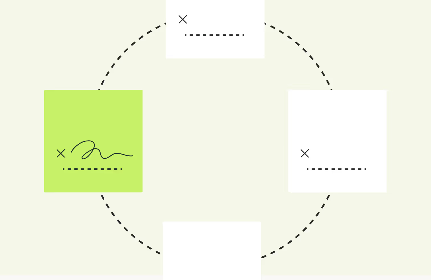
Visual design is the most obvious example of legal design in practice. It involves transforming the way information is presented to users in a way that resonates with them best. Contracts and other legal documents are a great example of this.
Most contracts are crammed with legal jargon and packaged in an intimidating way. As a result, the end users of the contracts, who aren’t always lawyers, struggle to engage with and understand the contracts they’re presented.
When you apply legal design principles to investigate why this is, there are a few clear problems for end users:
Instead of drafting contracts with lawyers and judges in mind, legal design thinking encourages people to create contracts with the layperson in mind.
{{quote2}}
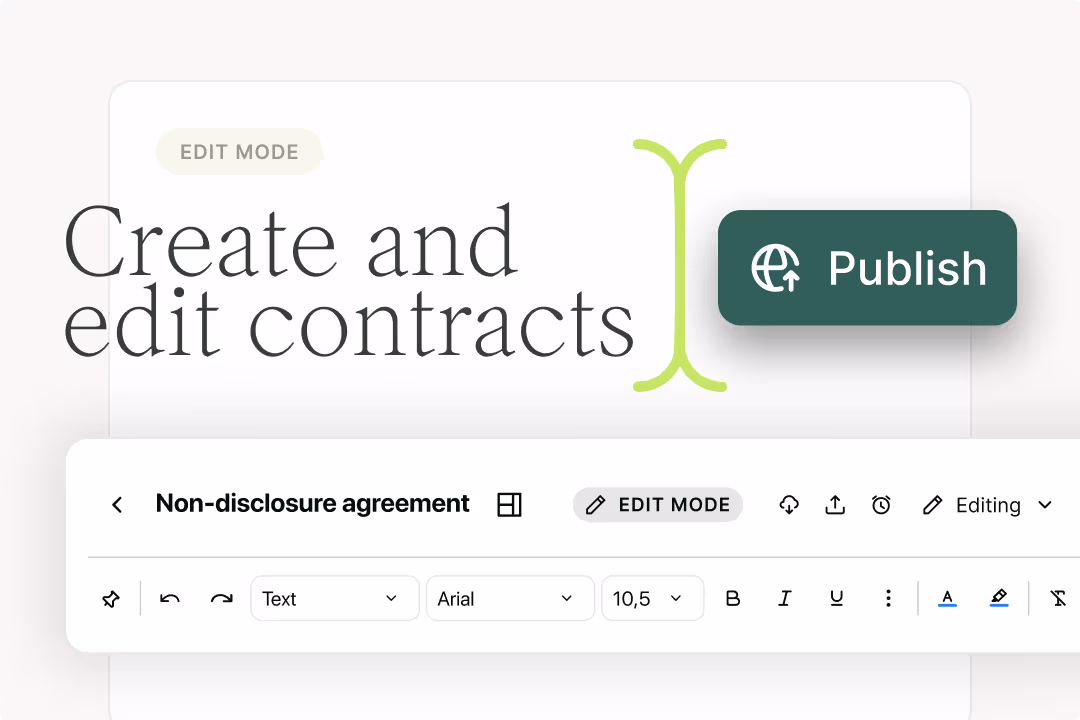
This can be done by adding images, videos, and other rich text to contracts to make them more engaging and digestible. Another design-centric solution is to bring all of the most important information to the forefront of the contract, rather than burying it in masses of text.
But it isn’t just the contract format that matters to users. It’s the words within a contract too. Since legal design principles focus on the user receiving the information in a way that makes sense to them, businesses should also consider drafting plain language contracts instead.
Process design is another branch of legal design that can be leveraged to improve the experiences of lawyers and those that work alongside them. Legal design principles can be applied to legal processes to identify pain points and provide user-centric, intuitive solutions to inefficient workflows.
One example of this is the process used to enable commercial teams to self-serve on legal queries and documents. In a manual process, commercial teams will reach out to the legal team whenever they have a law-related question, or need help drafting or reviewing a contract.
There are a few problems with this process:
It’s clear that the people using the process (legal and commercial teams) are both finding it painful. We’ve identified the problems they’re experiencing and how it affects their work. The next stage of legal design thinking is to brainstorm solutions to these problems.
One option is to create an interactive legal playbook for commercial teams to use. This playbook can include all of the answers to the questions that the company’s lawyers are asked most frequently. This can be established as the first port of call for legal questions, and something teams should consult with before contacting legal.
By redesigning the process in this way, legal teams have fewer distractions, commercial teams have access to answers on demand, and the process for accessing legal information is standardized. This redesign largely solves three of the most common problems users encounter.
The same applies to the contracting process. Commercial teams frequently rely on legal teams to draft, review and approve their contracts. But the problems users face are the same: distractions for legal, delays in contract lifecycles, and a lack of consistency.
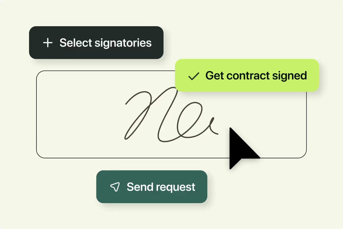
A solution to this is to allow legal teams to pre-define contract templates and make creating the contract as easy for commercial teams as possible. This can be achieved using automated contract templates that can be populated in seconds using a simple Q&A workflow like the one in Juro.
Rather than waiting around for legal teams to draft a contract, commercial teams can select a template and populate it by answering a few simple questions. Since the template was pre-defined and approved by legal, this can also remove the need for routine contracts to need further approval down the line.
This process redesign means that legal can focus on higher-value tasks while commercial teams self-serve confidently on contract creation, with no blockers. Again, this solution focuses on improving both the experience and confidence of stakeholders when managing legal documents like business contracts.
Hit the button below to find out more about Juro’s automated templates and Q&A workflows.

What we described above probably sounds like a lot of work. But legal design is a reiterative process designed to improve processes in the long-term, not the short-term. Besides, the benefits of implementing legal design often outweigh the costs of doing so. Some of these benefits include:
But there are also a few, more specific benefits of legal design for in-house lawyers, such as more effective communication and better prioritization.
To recap: legal design can transform the experiences of those within the legal industry. But adoption isn’t simple. It needs to be a long-term objective that your business works towards, rather than a quick box-ticking exercise.
If you’re interested in finding out how legal design can improve your contracting process using a tool like Juro, fill in the form below.
Lorem ipsum dolor sit amet, consectetur adipiscing elit. Suspendisse varius enim in eros elementum tristique. Duis cursus, mi quis viverra ornare, eros dolor interdum nulla, ut commodo diam libero vitae erat. Aenean faucibus nibh et justo cursus id rutrum lorem imperdiet. Nunc ut sem vitae risus tristique posuere.
Hello. We are Juro Online Limited (known by humans as Juro). Here's a summary of how we protect your data and respect your privacy.


Margaret Hagan, Executive Director at Legal Design Lab

Stefania Passera, Founder at Passera Design